QuickBooks
Packaging Design System
- Physical Design Language
- Industrial Design
- Packaging Design
- Product Photography
- Creative Direction
The Client's Challenge
Develop a modern scalable packaging system for Intuit’s new payments hardware system that showcases the product design quality, the customer and merchant experiences, and communicates how it supports the evolving needs of small business owners.
The Strategic Approach
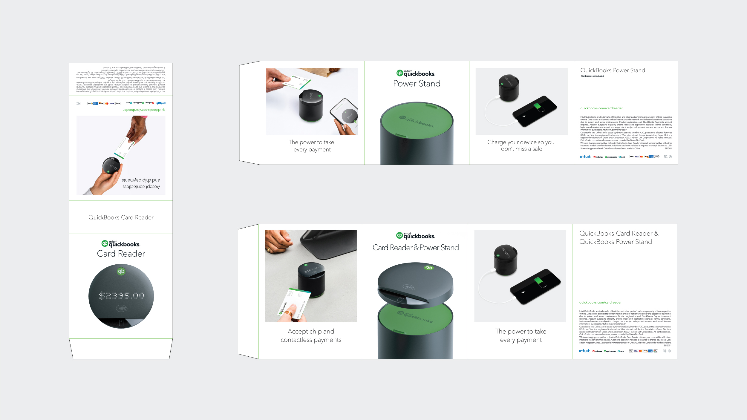
Early on, with Intuit, we aligned on the SKU strategy to be the standalone products of the Card Reader and Power Stand, as well as a bundle of the two. Clarity of SKUs allowed us to zero in on a packaging architecture. Leveraging outer sleeves for all product photography and copy offered a system that can easily adapt to different markets and languages, leaving the core packaging boxes to remain pure vessels to protect and celebrate the hero products. This strategy allowed us to define a creative blueprint with unique photography per SKU to emphasize the product experience.

The Creative Solution
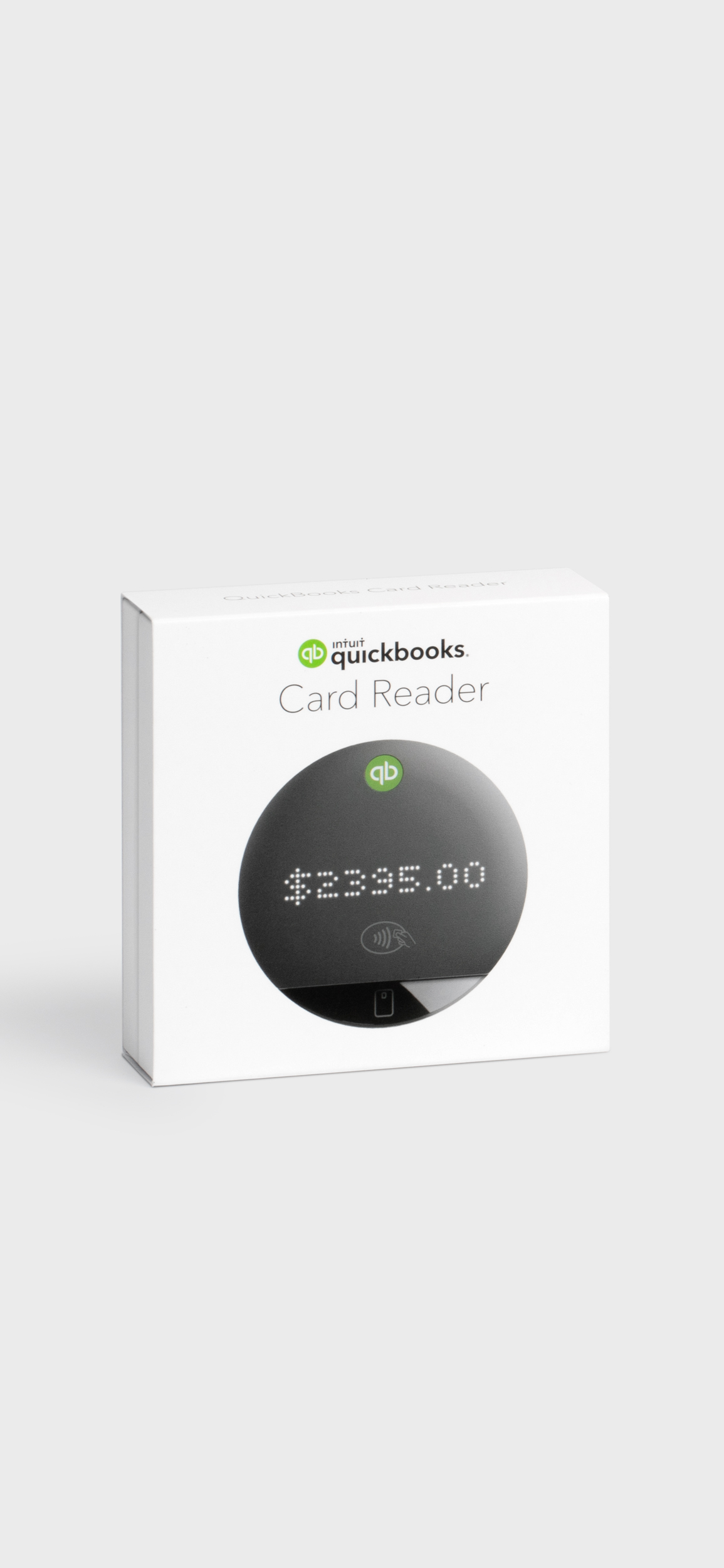
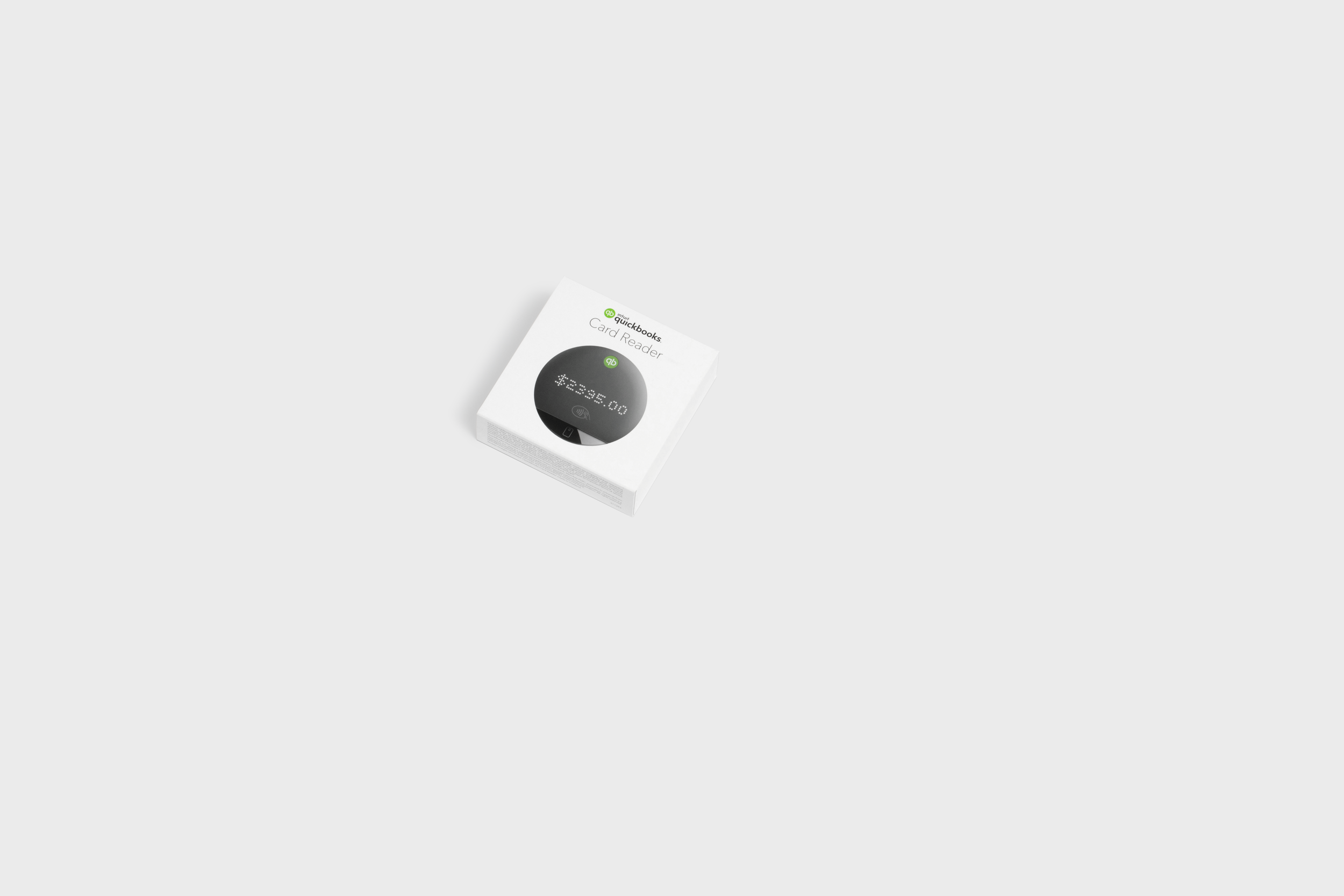
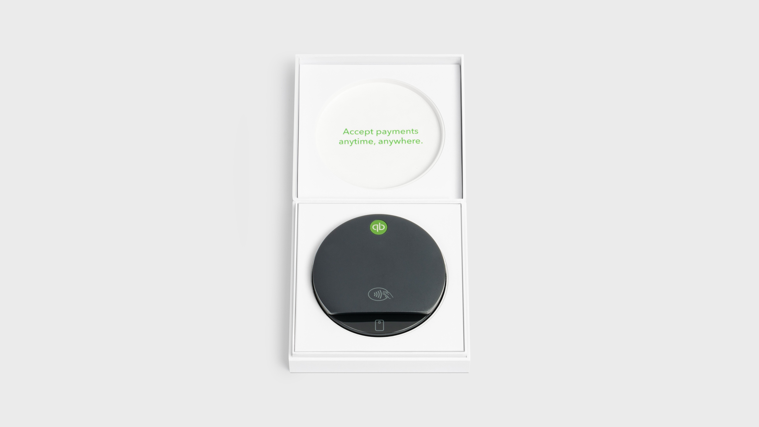
Less is More was truly our creative philosophy. From a Structural Design perspective the concept is centered around graphic sleeves and gift‑like boxes. The OOBE delivers a stunning reveal of the products, having them framed on pure white ‘pedestals’ to allow the design quality to be appreciated, with the 50/50 split of the lid and base allowing the lid to rest perfectly flat when opened. Layering as a design principle guided our approach for how each packaged element is revealed in a considered and ordered way.
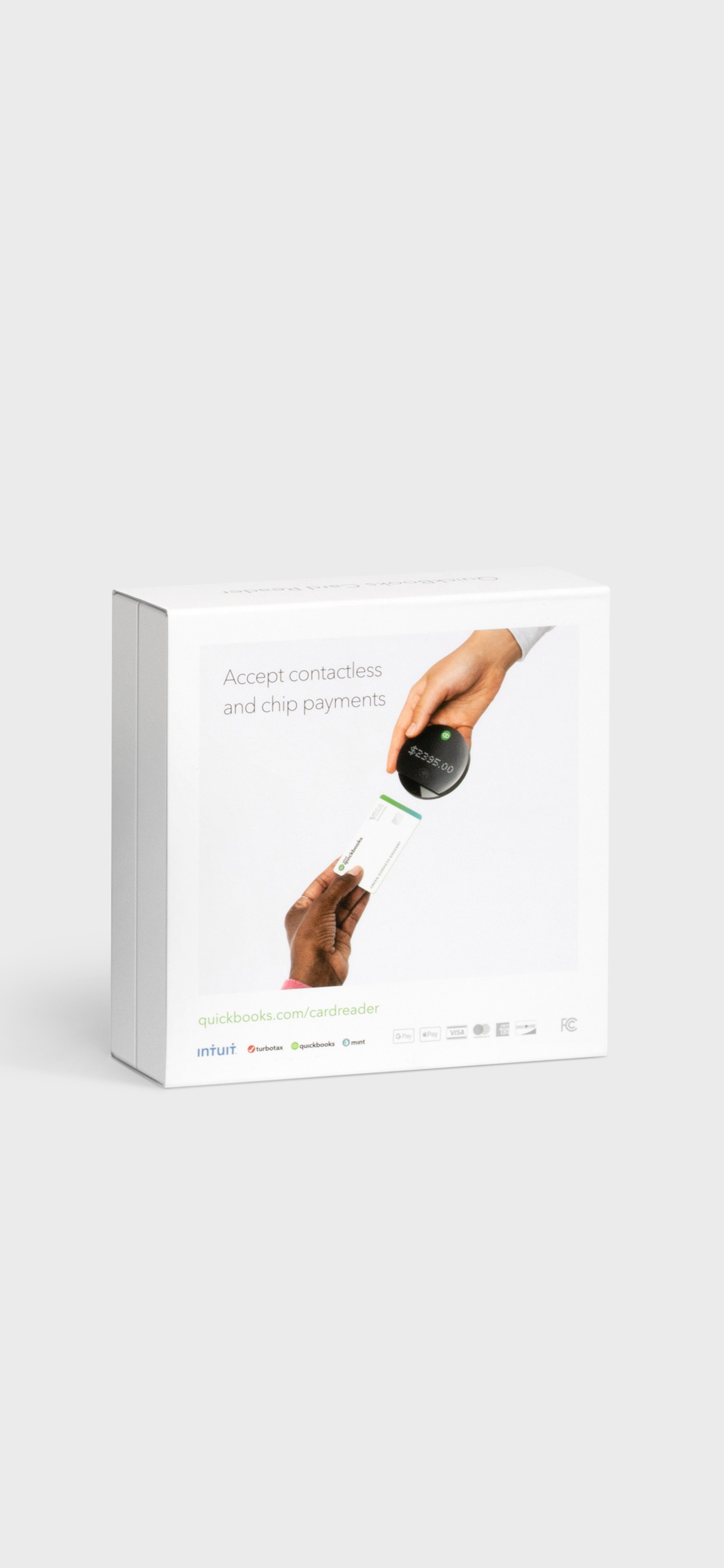
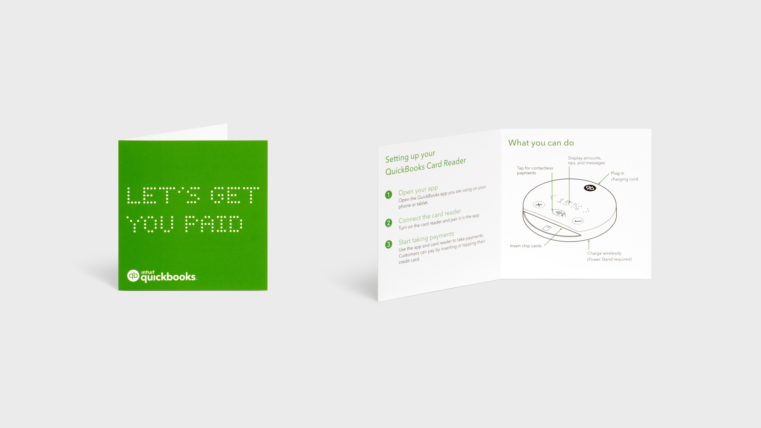
The Graphic Design System leverages beautiful photorealistic renderings for the product images on the front and dynamic storytelling‑inspired photography on the rear, leaving the sides of the sleeves for support images and copy, and the top of the boxes for a centered QuickBooks qb mark in a spot varnish color pop.
The Business Impact
Launched in Q3 2021, sales have exceeded expectations.
For the Intuit QuickBooks brand, this cohesive packaging design system helps clearly articulate the quality of design and the core value propositions of the products, ultimately delivering a powerful point‑of‑sale solution delightfully designed to seamlessly integrate software and hardware, expanding QuickBooks’ position as a partner to and source of truth for millions of small businesses.
Design Awards

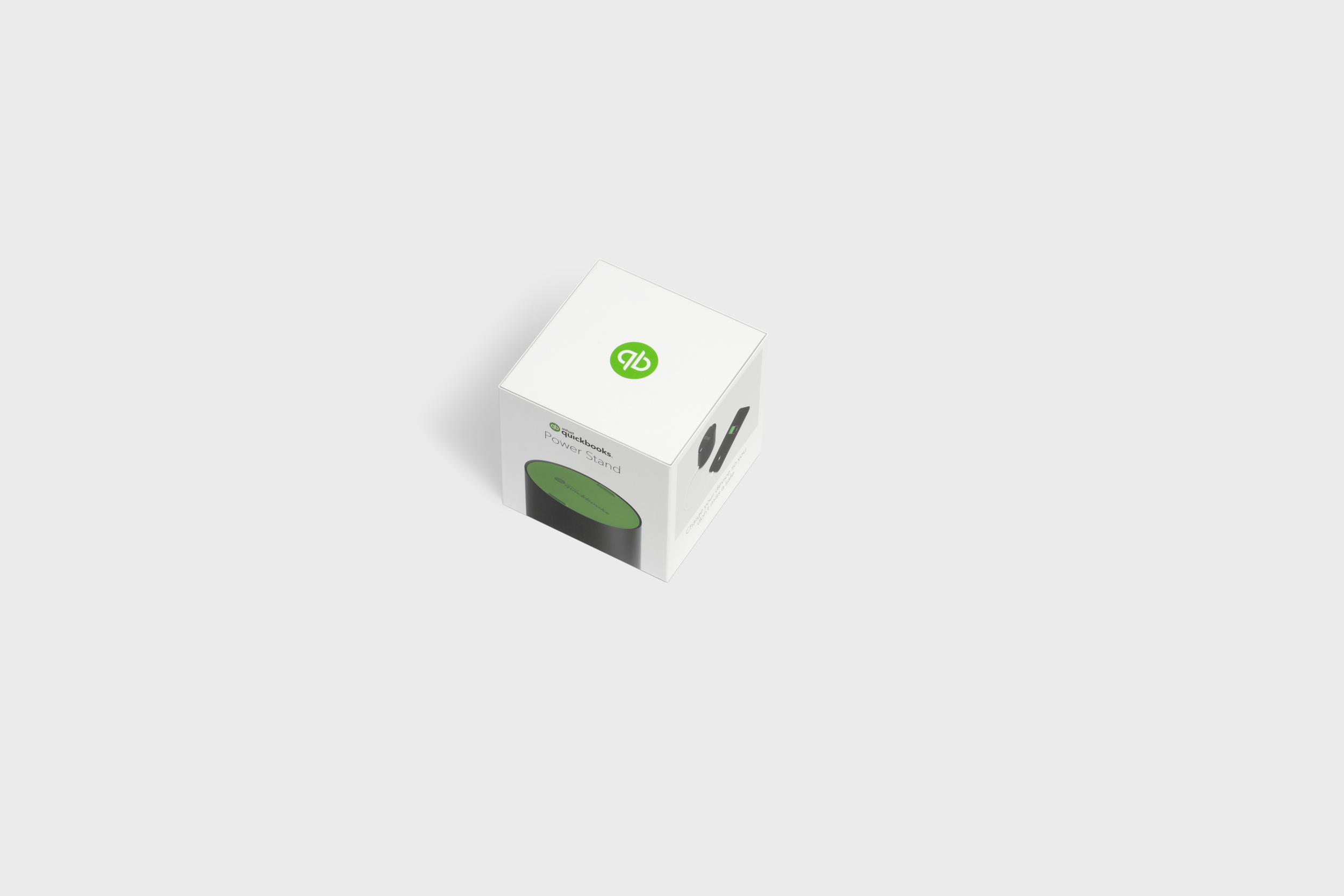
QuickBooks Power Stand
The Packaging Design for the Power Stand follows the same ‘Less is More’ philosophy of the Card Reader. The Power Stand’s weight requires it to be well supported in the bottom half of the packaging, yet during the OOBE you still appreciate the form, the color palette, and material qualities on the first reveal.
This packaging design requires a variation of a full height lid, yet the base still preserves perfect 50/50 dimensional symmetry, a signature of the proportional rigor of this Packaging System.

Graphic Design Blueprint
When partnering with clients with their own in‑house design teams, we aim to create what we call a Design Blueprint. This sets the vision for the graphic system: the composition of elements, the visual hierarchy, the placement of brand / logos, the use of photography or illustrations, regulatory information, barcode placement, etc. Developing the Blueprint collaboratively builds buy‑in and ownership early, leaving final copy for the client to own and for final artwork approvals to go smoothly.